Our Audience is towards Families with a higher income than most. those who could afford a more focused effect on controlling their homes
Brand Words
Clarity, Security, Warmth
The icon at the biggest size vs. the smallest
Competitive Landscape Icon
Icon viable at the smallest scales, Icon at 38x20
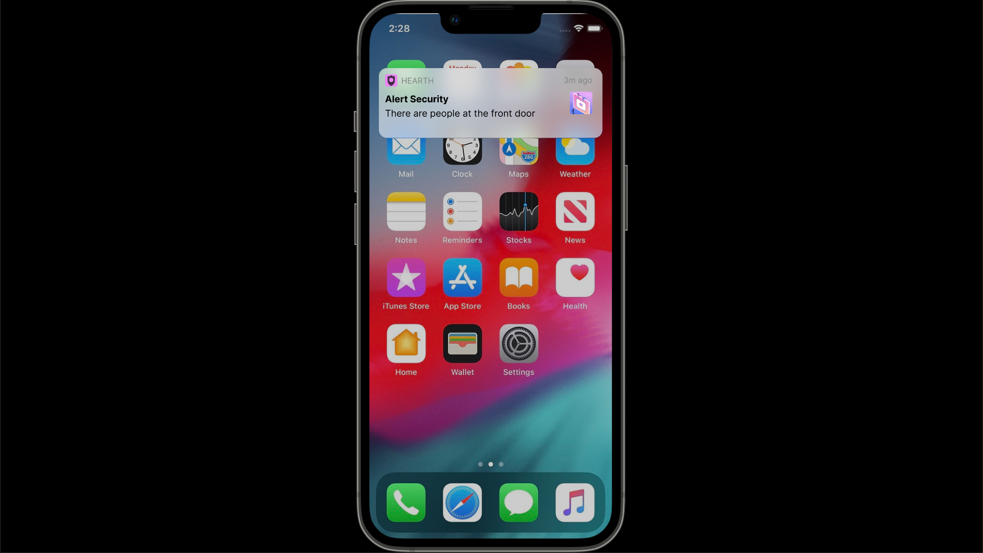
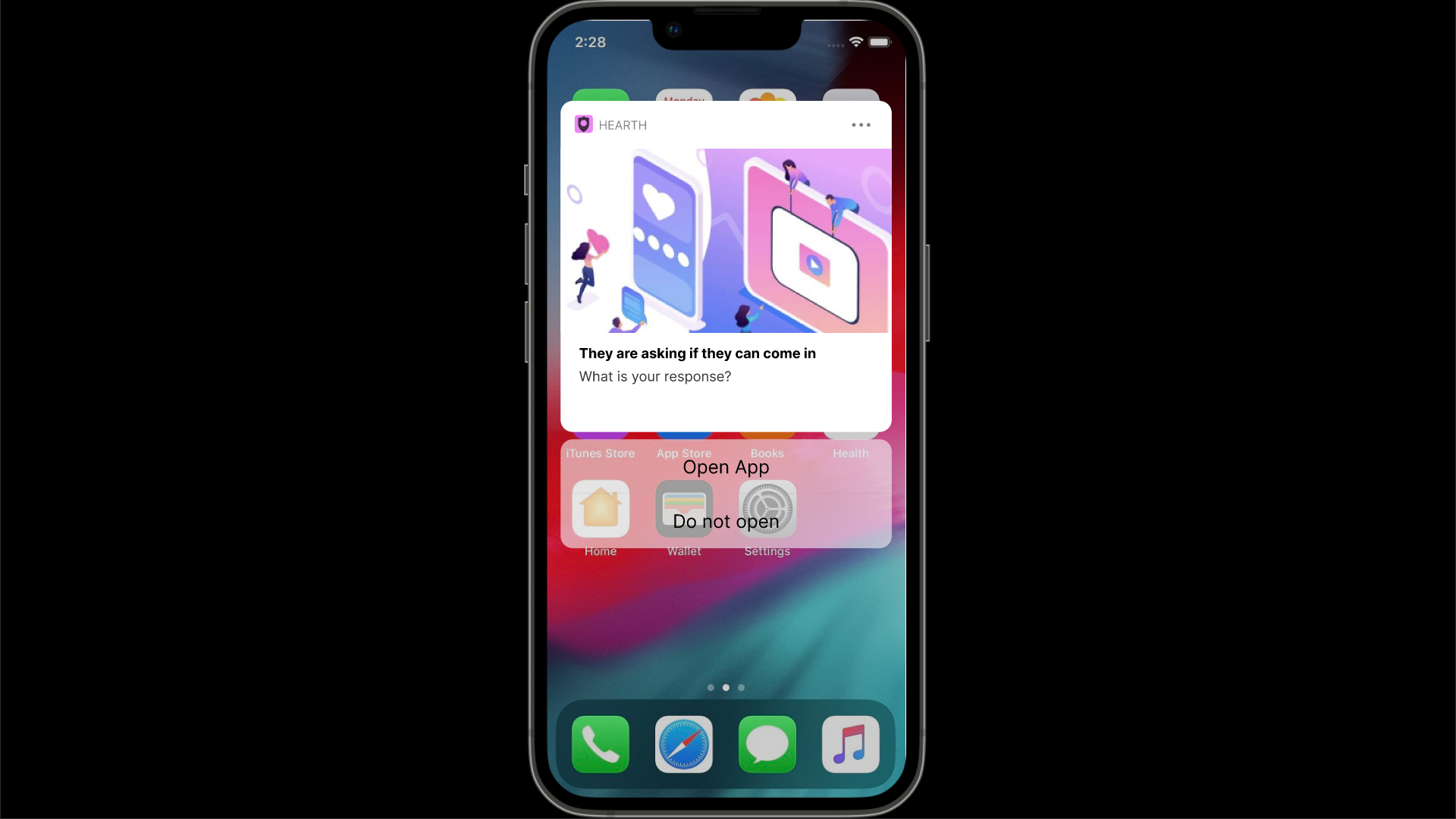
Main Features
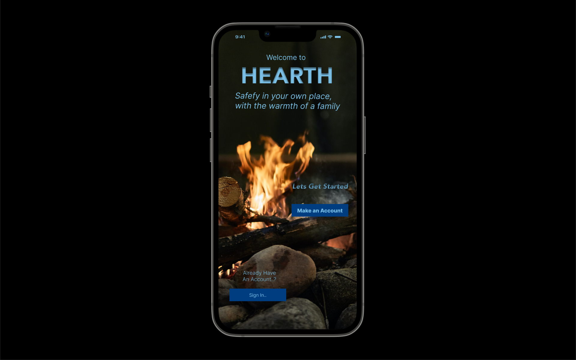
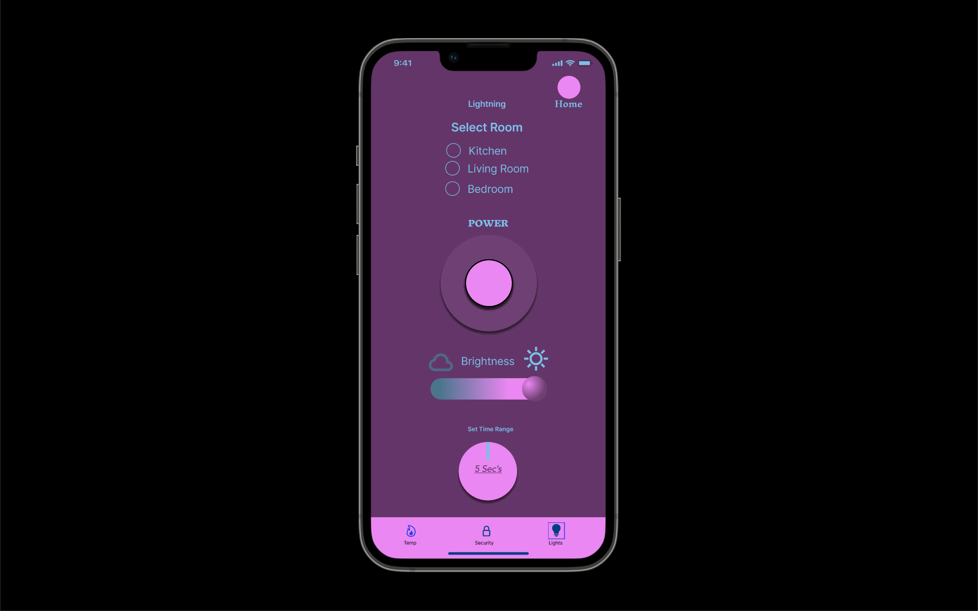
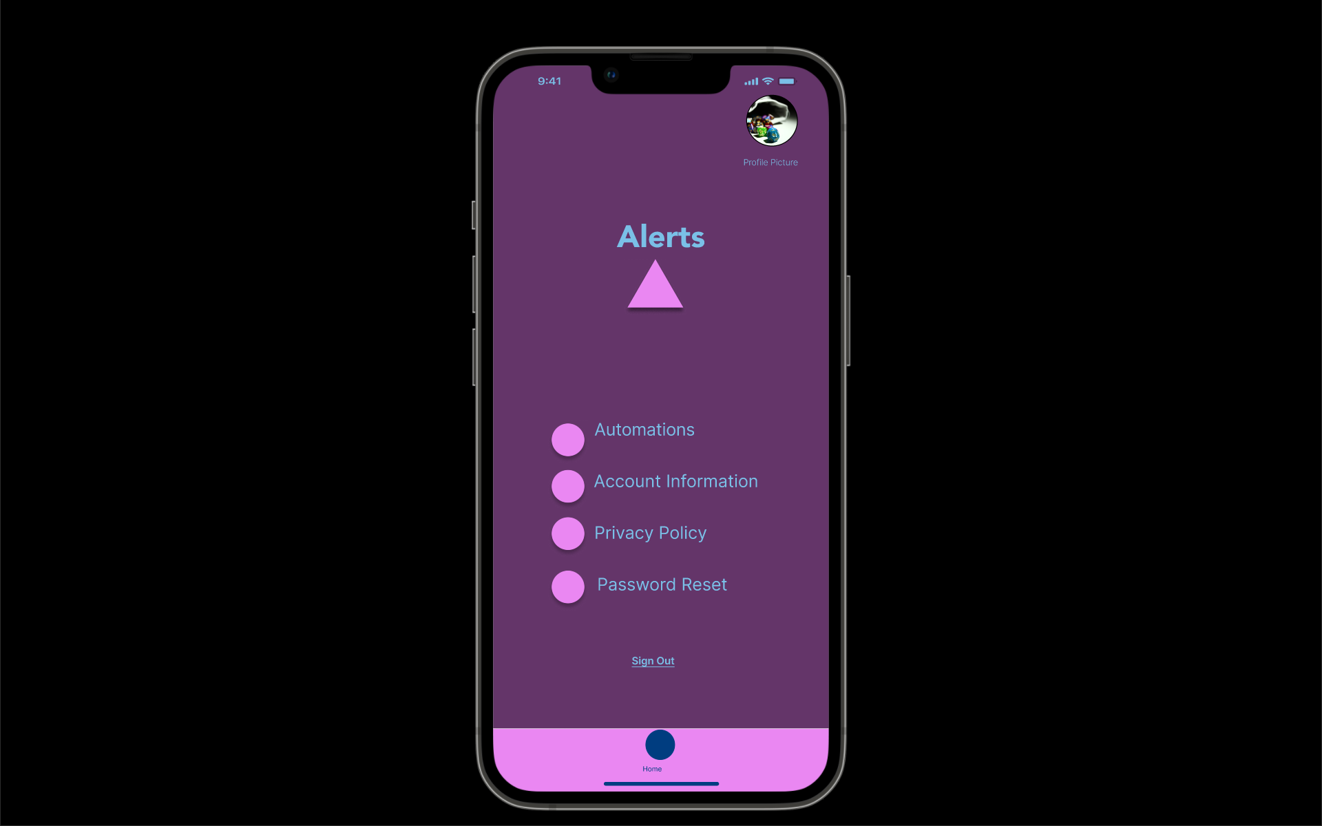
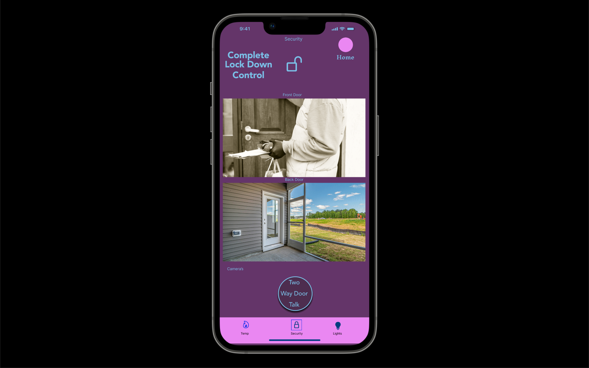
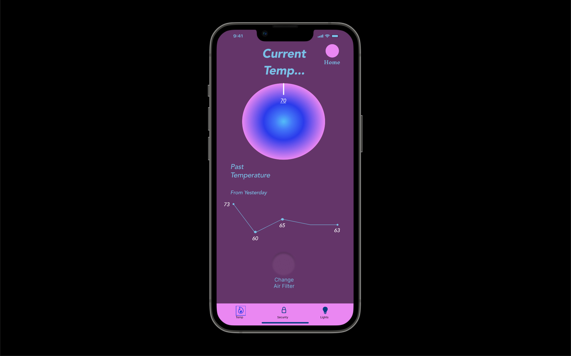
Finally, my Design of the app was based on simple but elegant solutions that I feel tell what they are used for without overly explain and using common shorthand words that have a close familiar feeling was what I was aiming for the overall design.
Here is the finished product.
Play with the protype listed below...
Wireframe Protype First Time
Remake Wireframe
Main changes were that I adjust the location of automations and energy usage levels and made home button more noticeable.
Typographic System
Inter Body Text, Avenir ST for Headings and wordmark.
Avenir ST Family was chosen for the heading and wordmark as I felt it called attention
and showed clarity.
Exploration of Making of Hearth Wordmark
Through Leading and different variants of the main typefaces
Testing Wordmark in Concept Application
Structure of Wordmark
Looking at the kerning of the developing wordmark
Competitive Landscape
Physical Proofs of wordmark


